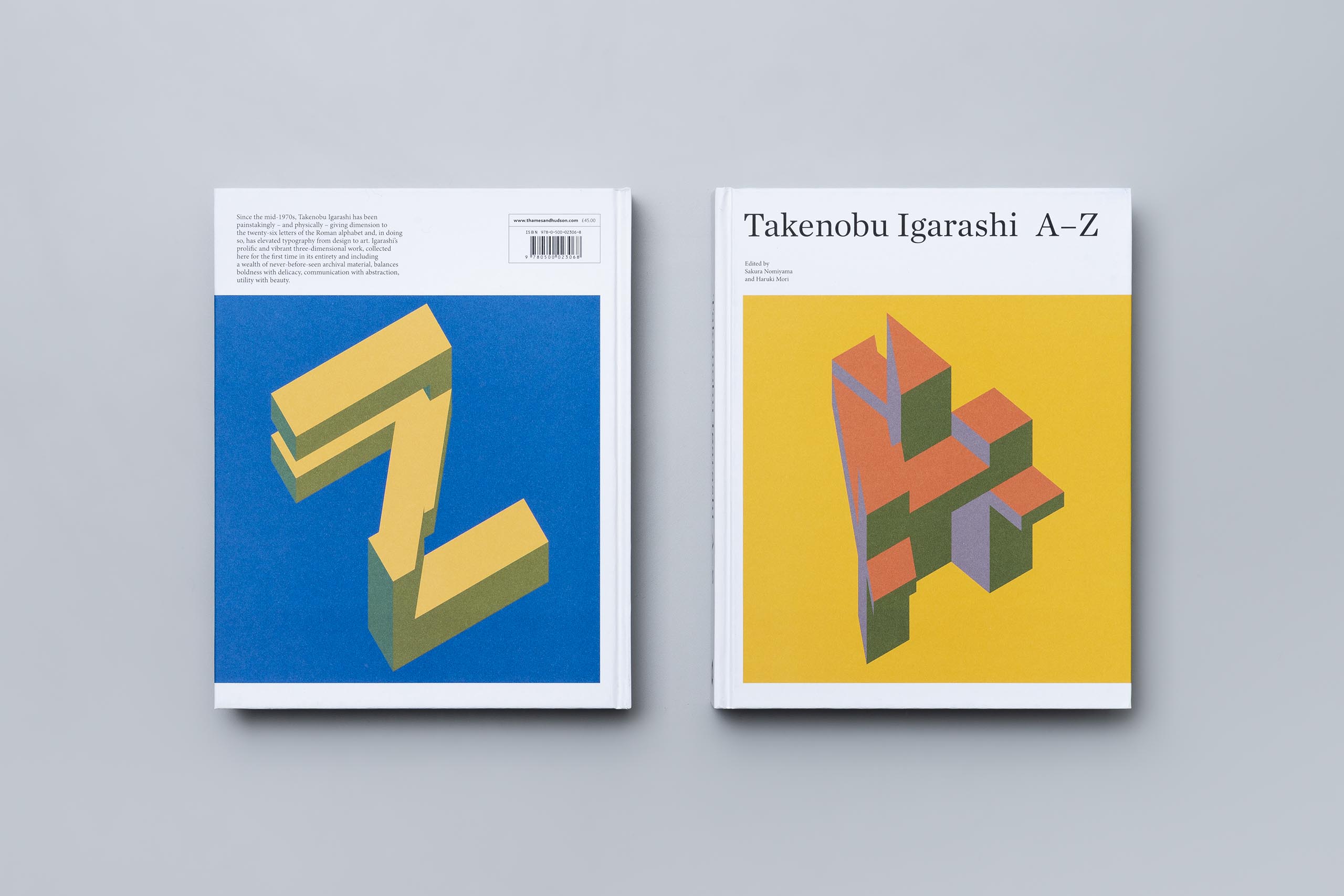
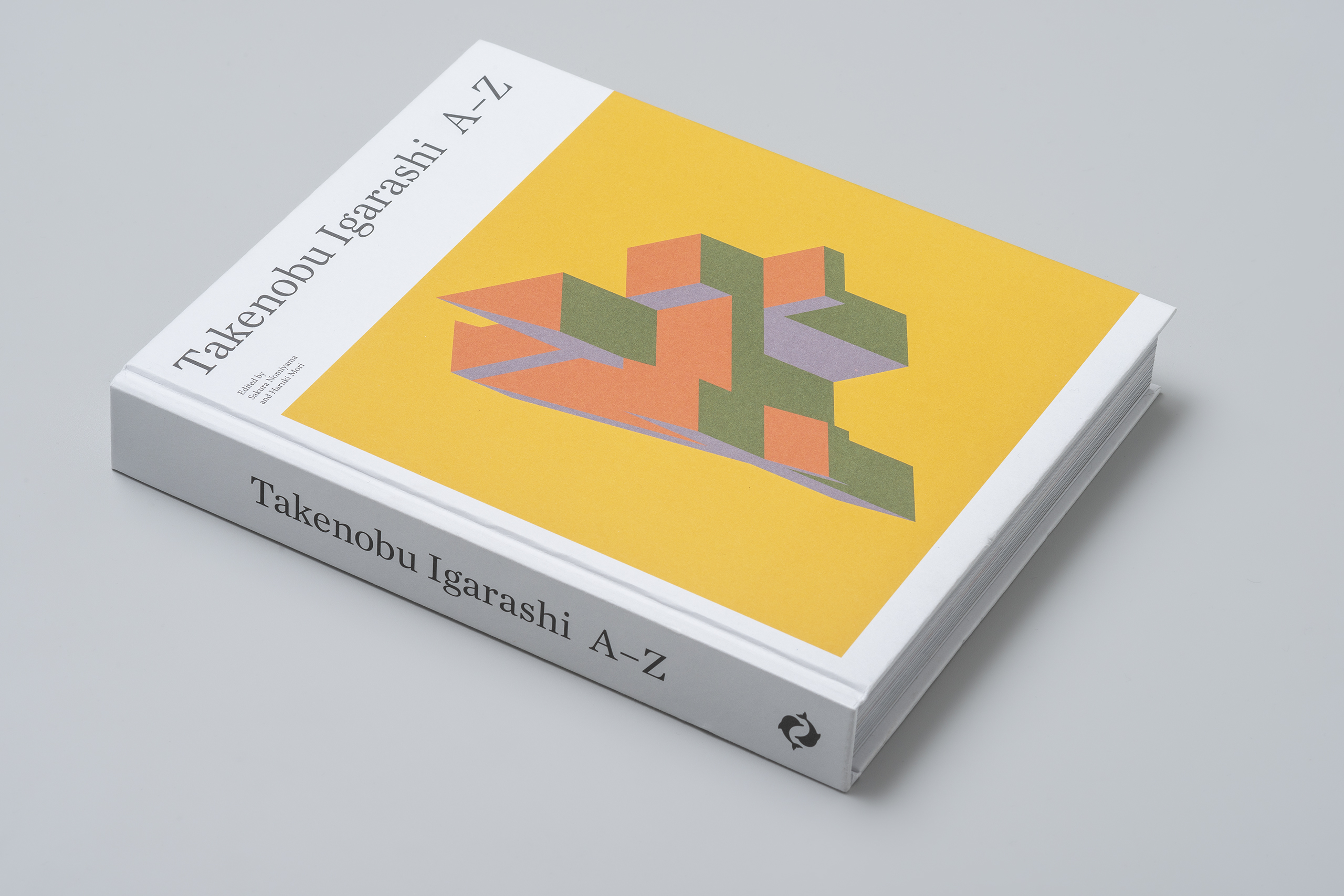
Takenobu Igarashi A-Z
Editorial, Graphics
Unravelling the world of
Takenobu Igarashi’s axonometric typography.
Mission
Thames & Hudson (T&H) is a British publisher of illustrated books on Art, Architecture, and Design. In 2016, upon the launch of Volume, their new crowdfunded publishing platform, the publishers approached designer and sculptor Takenobu Igarashi to participate in its second project. Igarashi appointed design historian and researcher Sakura Nomiyama and graphic designer Haruki Mori as editor and designer of the book and as project managers to work with T&H.
Solution
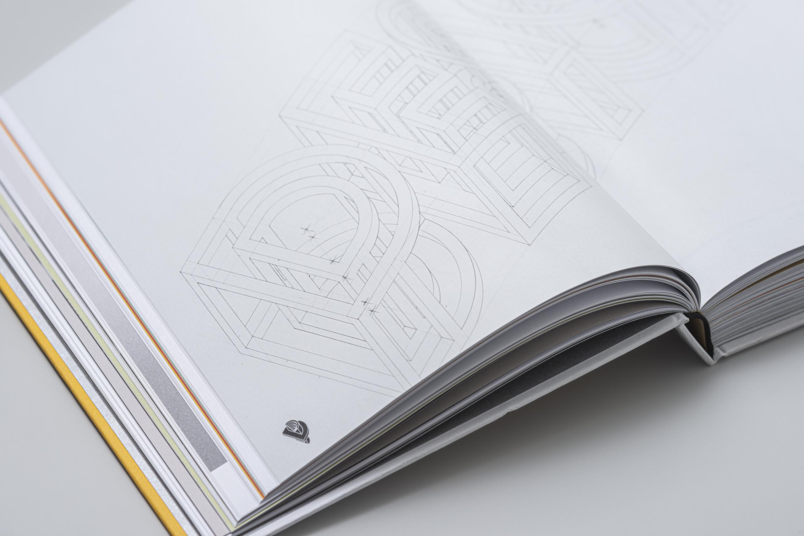
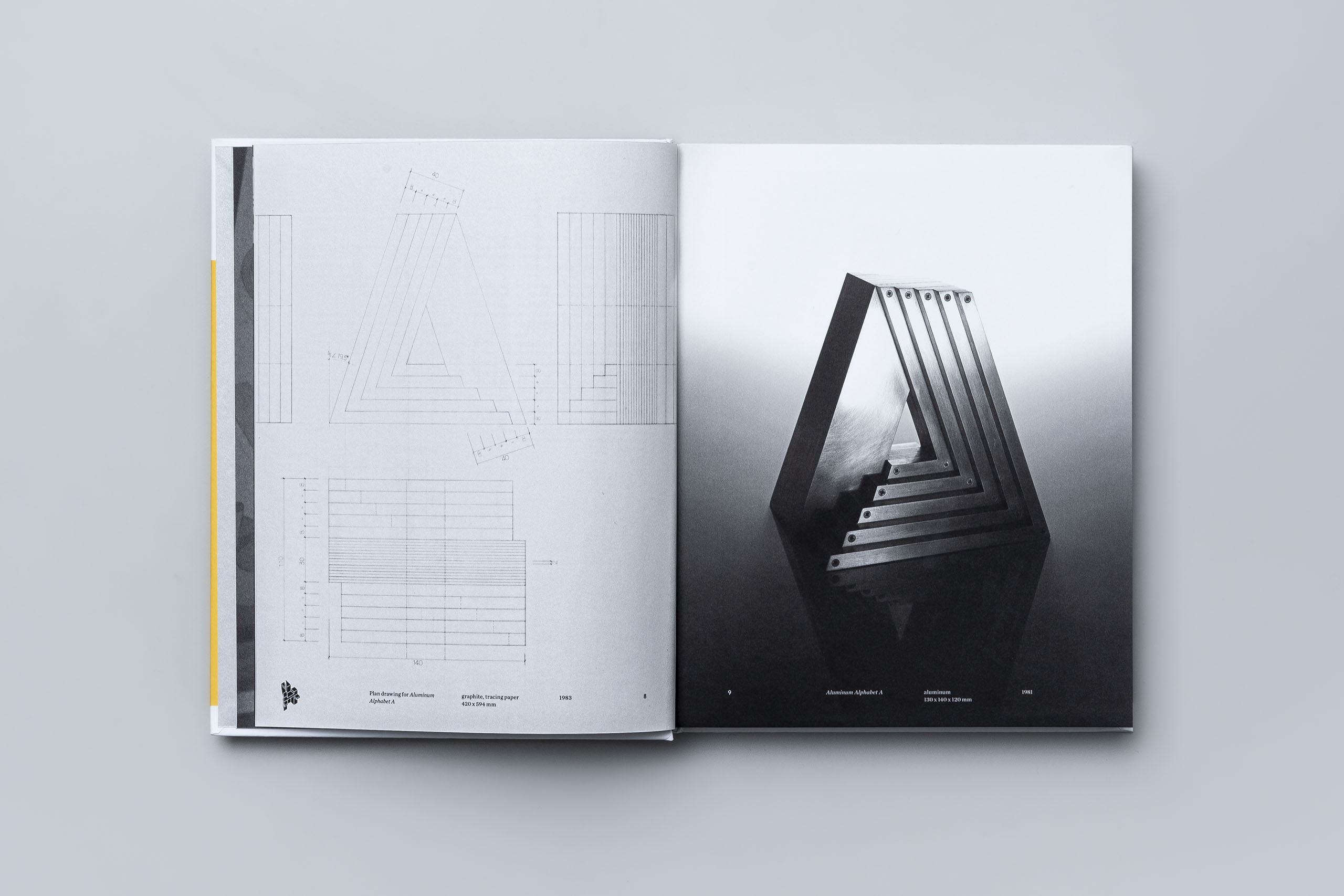
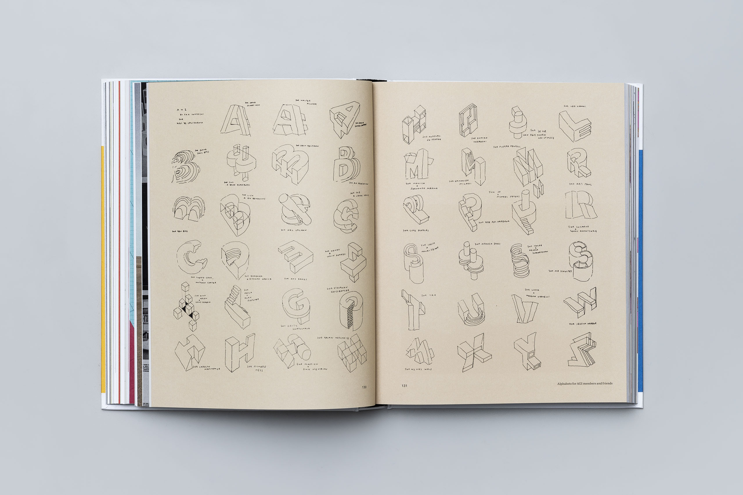
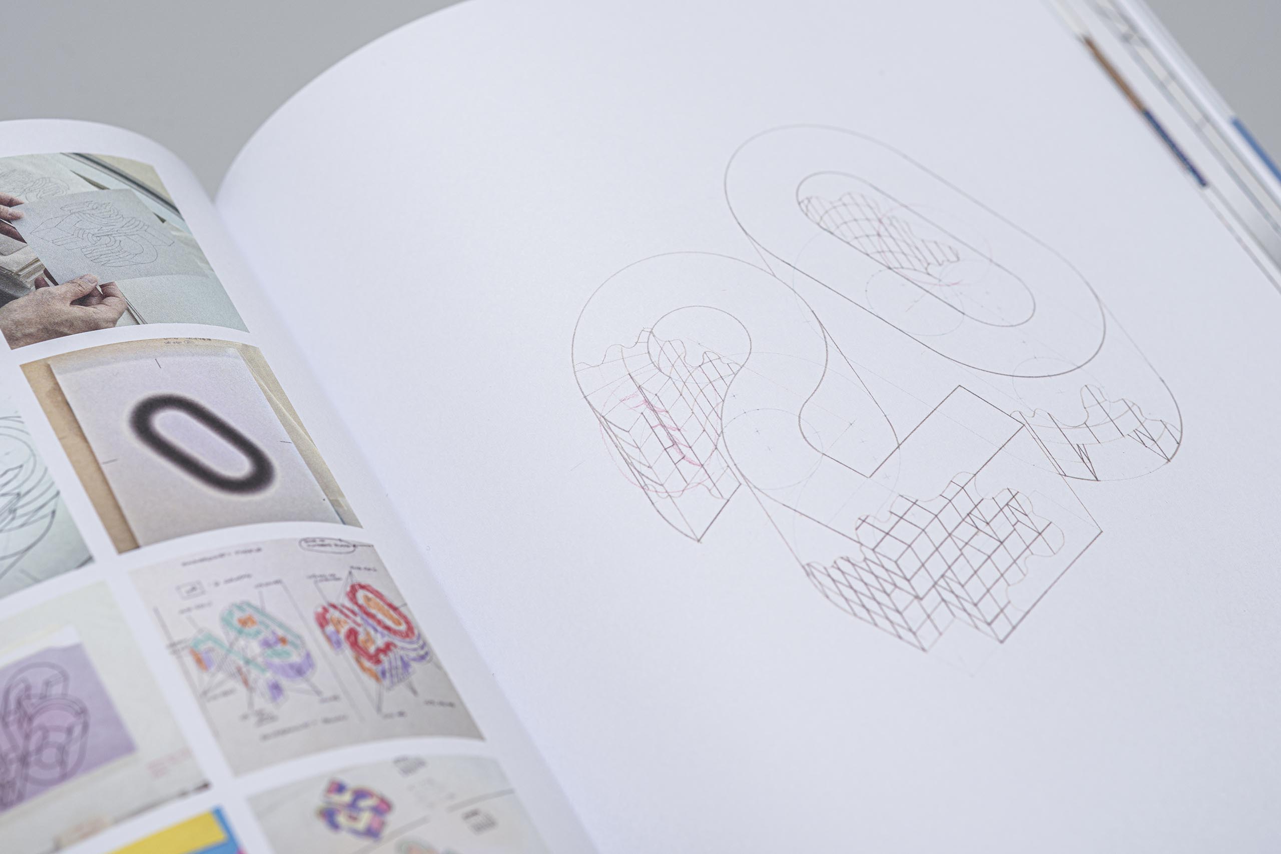
In response to Volume’s request, Igarashi proposed to publish a book on his axonometric alphabet works during the 1970s to 1994. We started by photographing his exhaustive archival material of plans, articles, production drafts, and drawings, many of which were never seen before. Engaging in a series of interviews with Igarashi and through numerous discussions among Nomiyama, Mori and Igarashi himself, the book started to take shape.
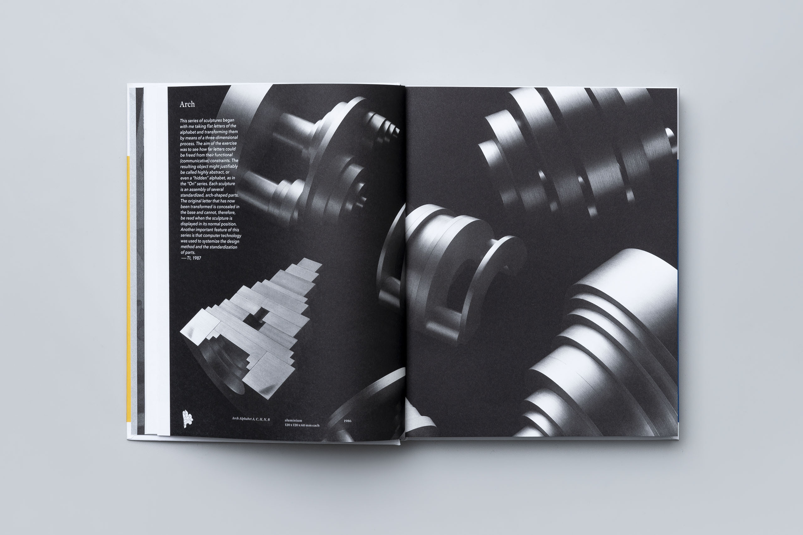
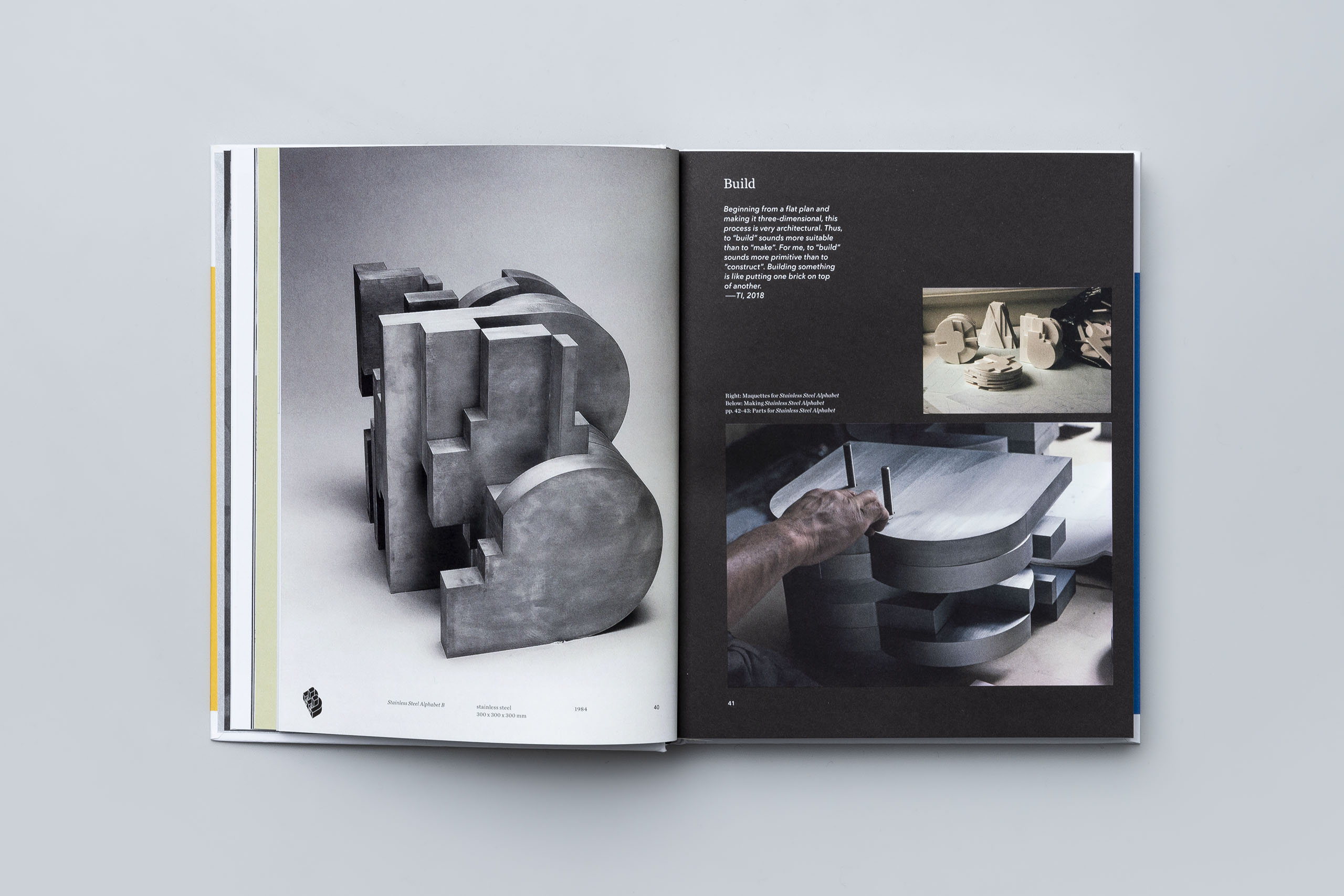
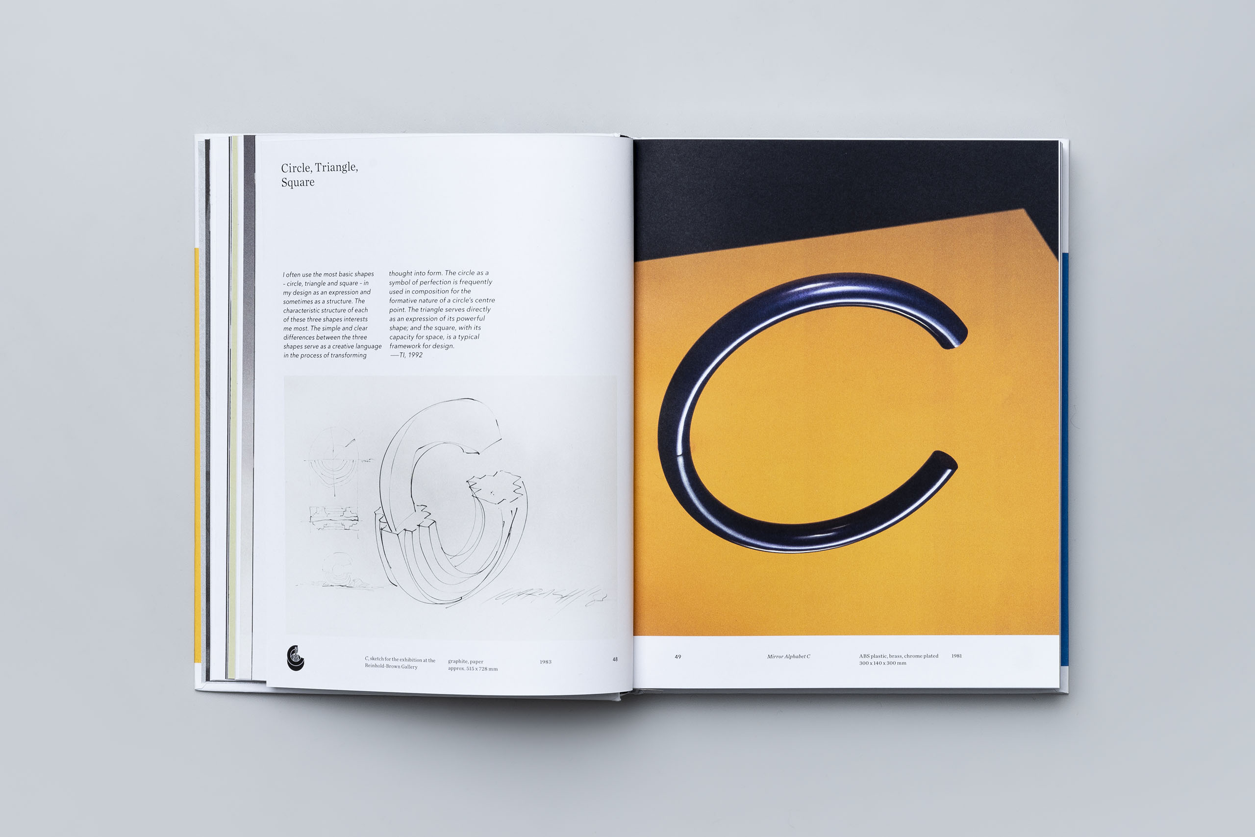
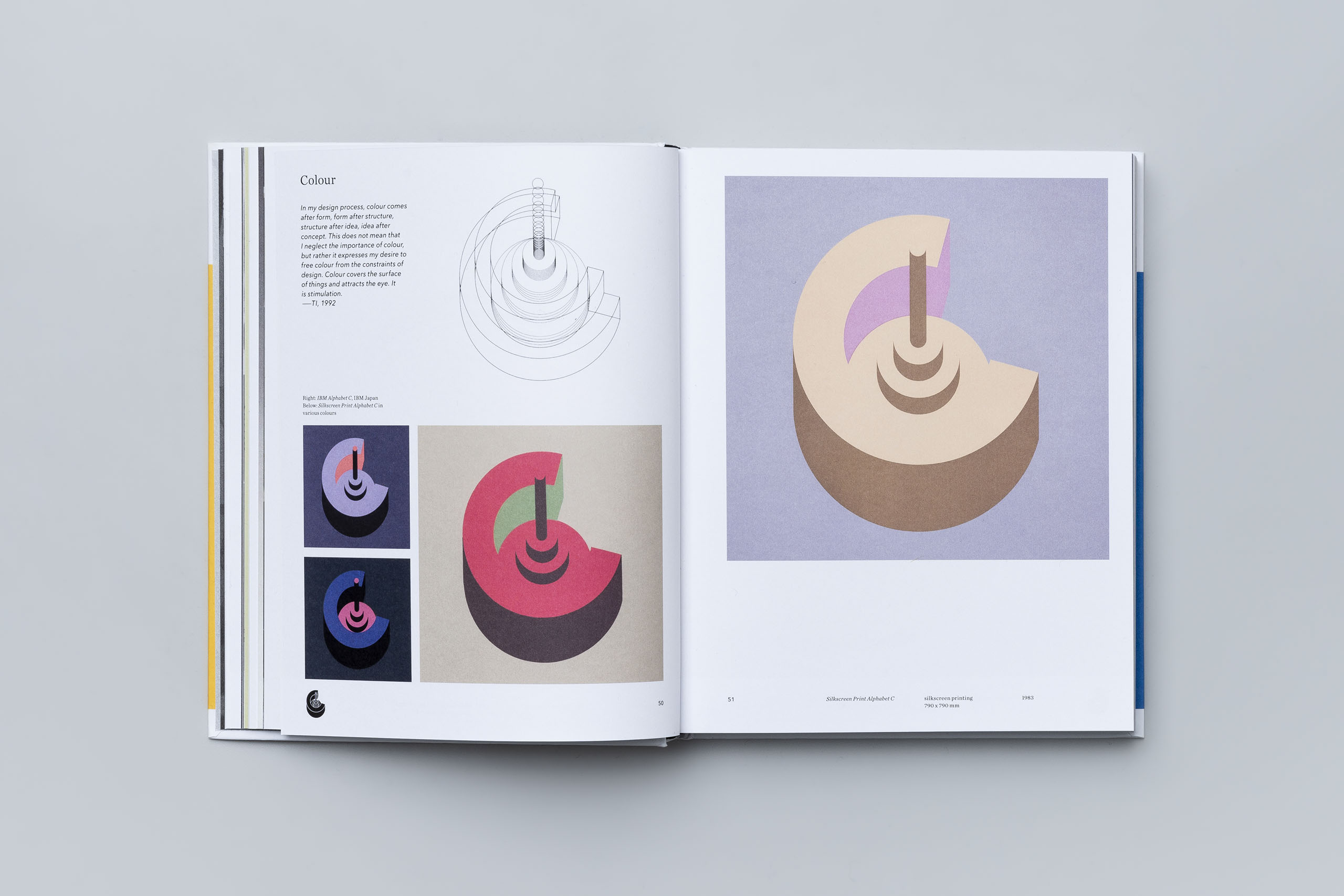
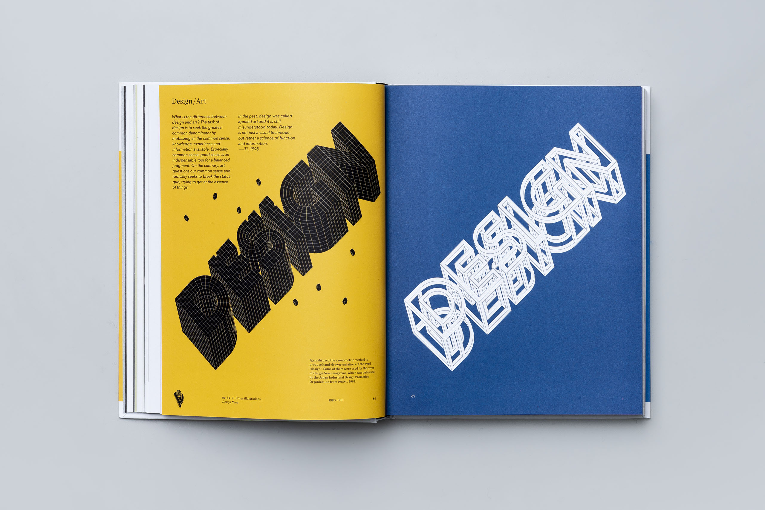
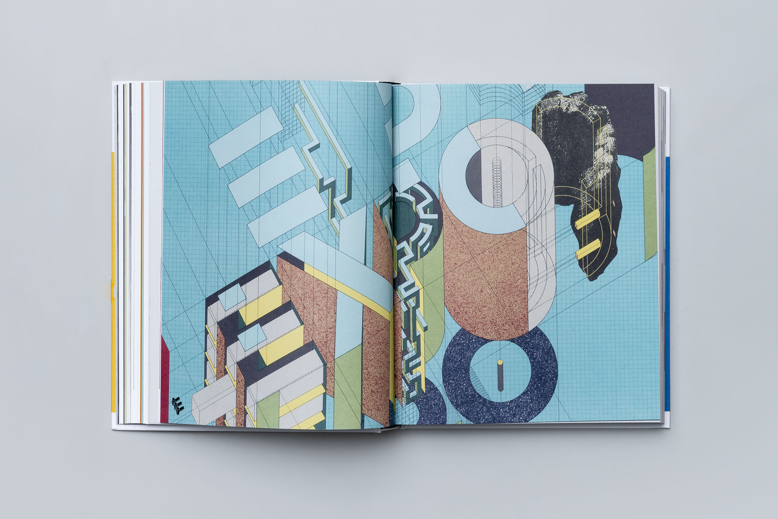
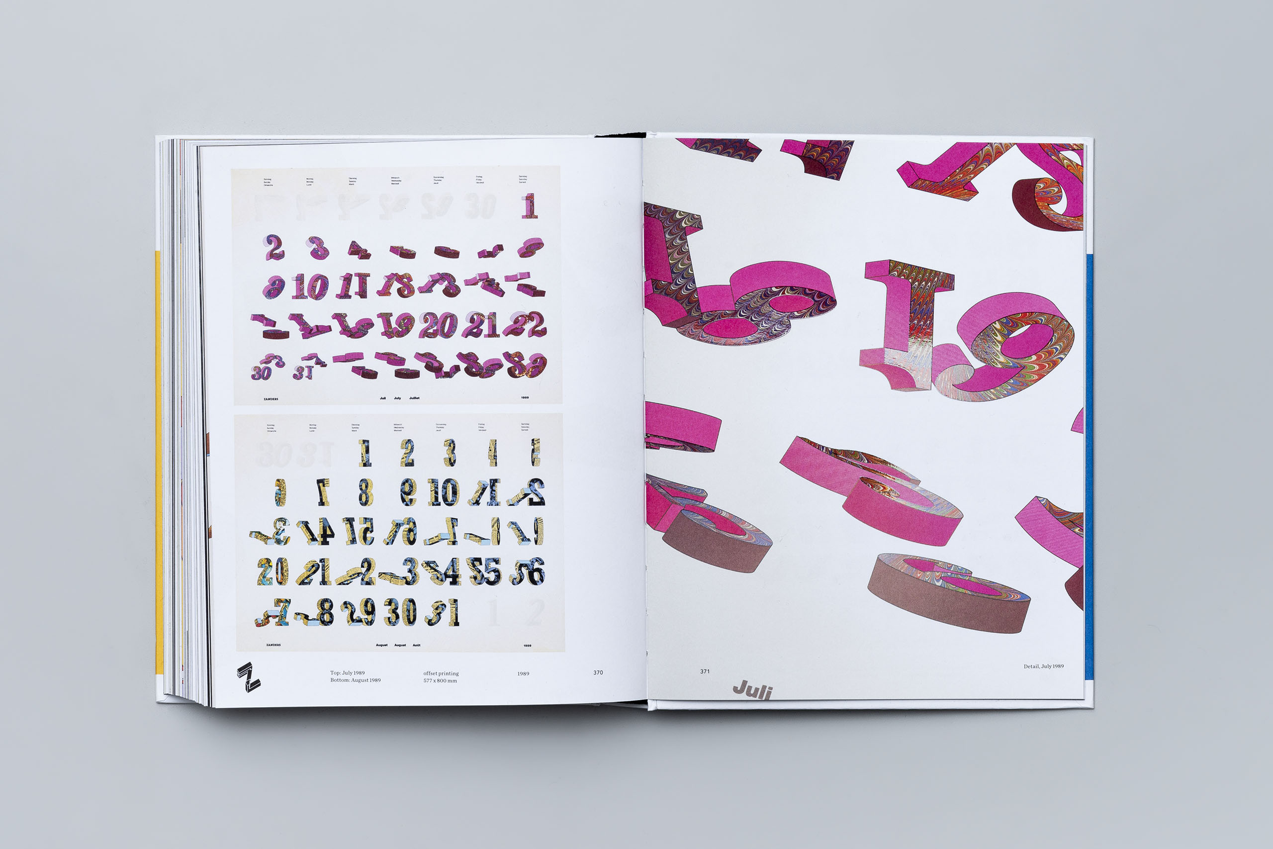
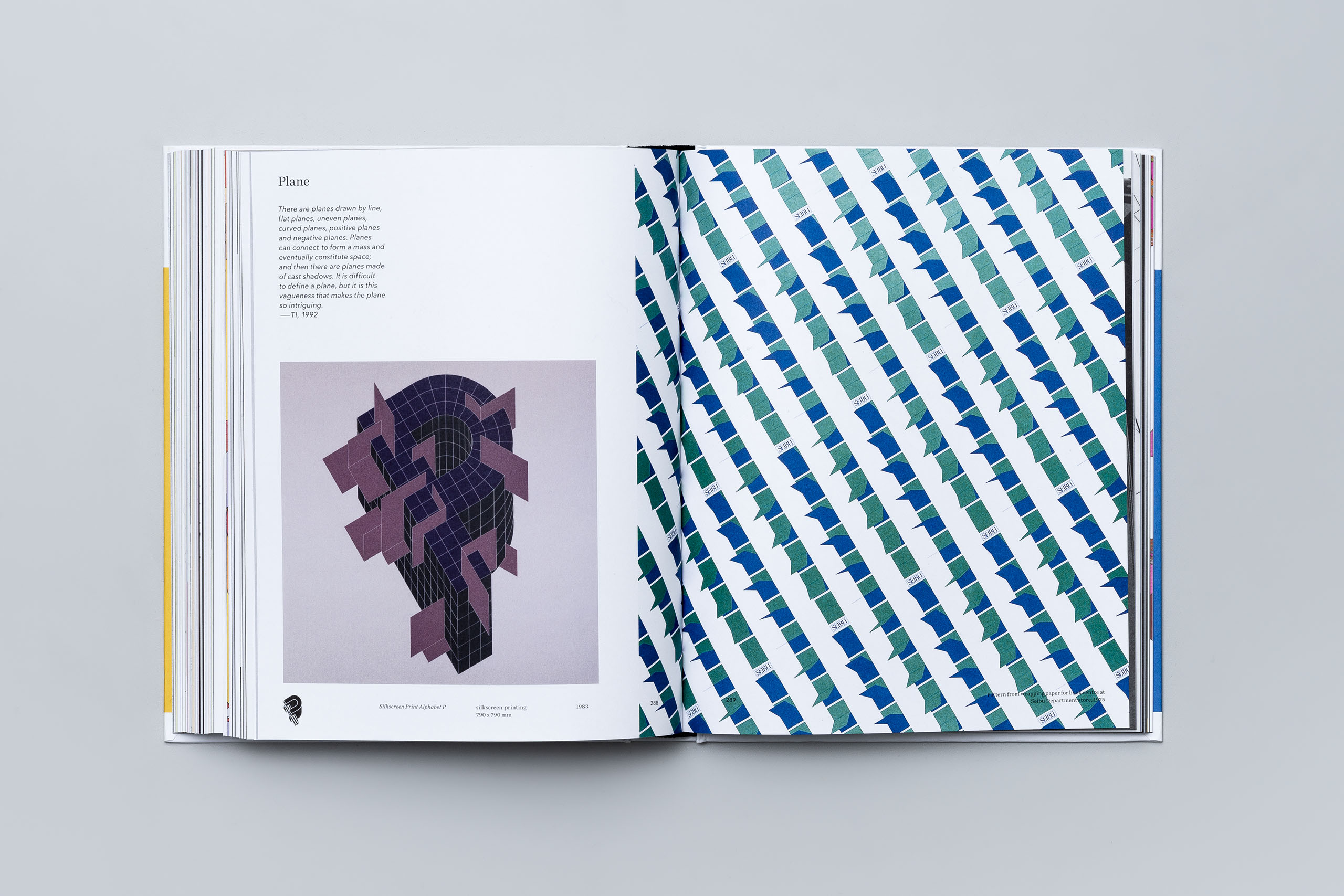
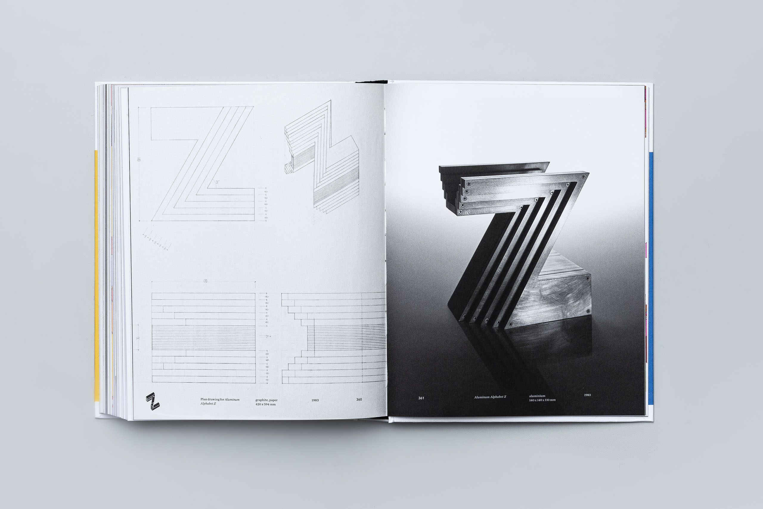
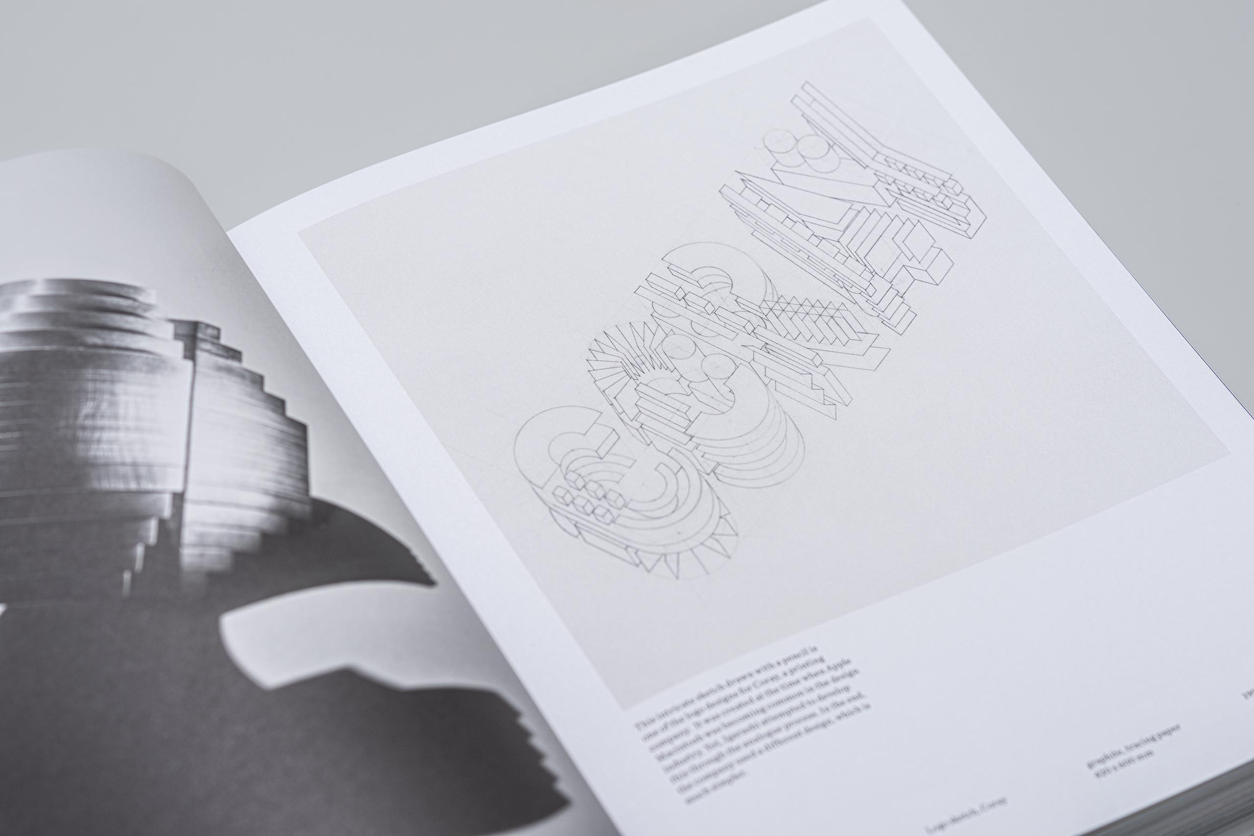
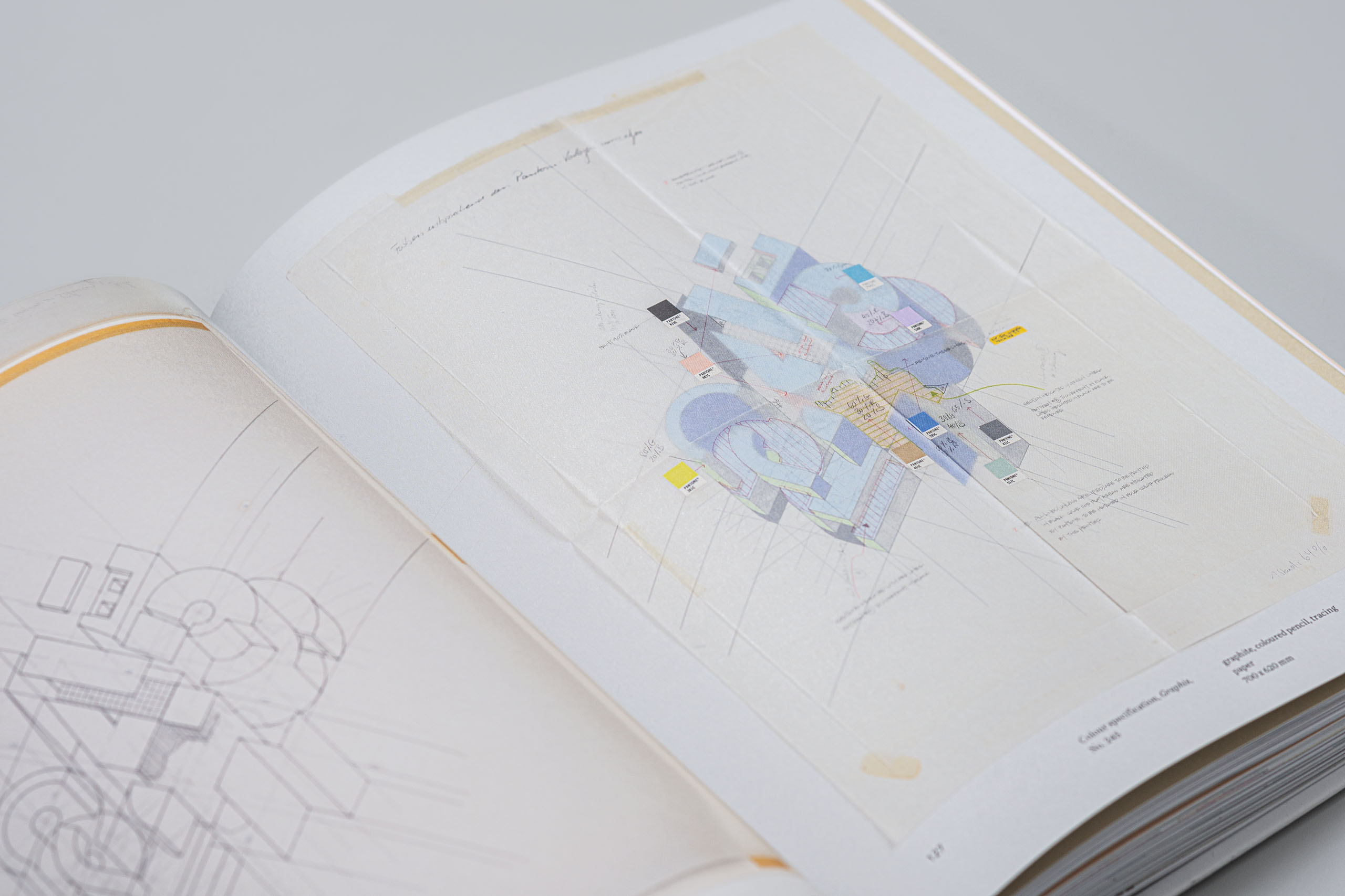
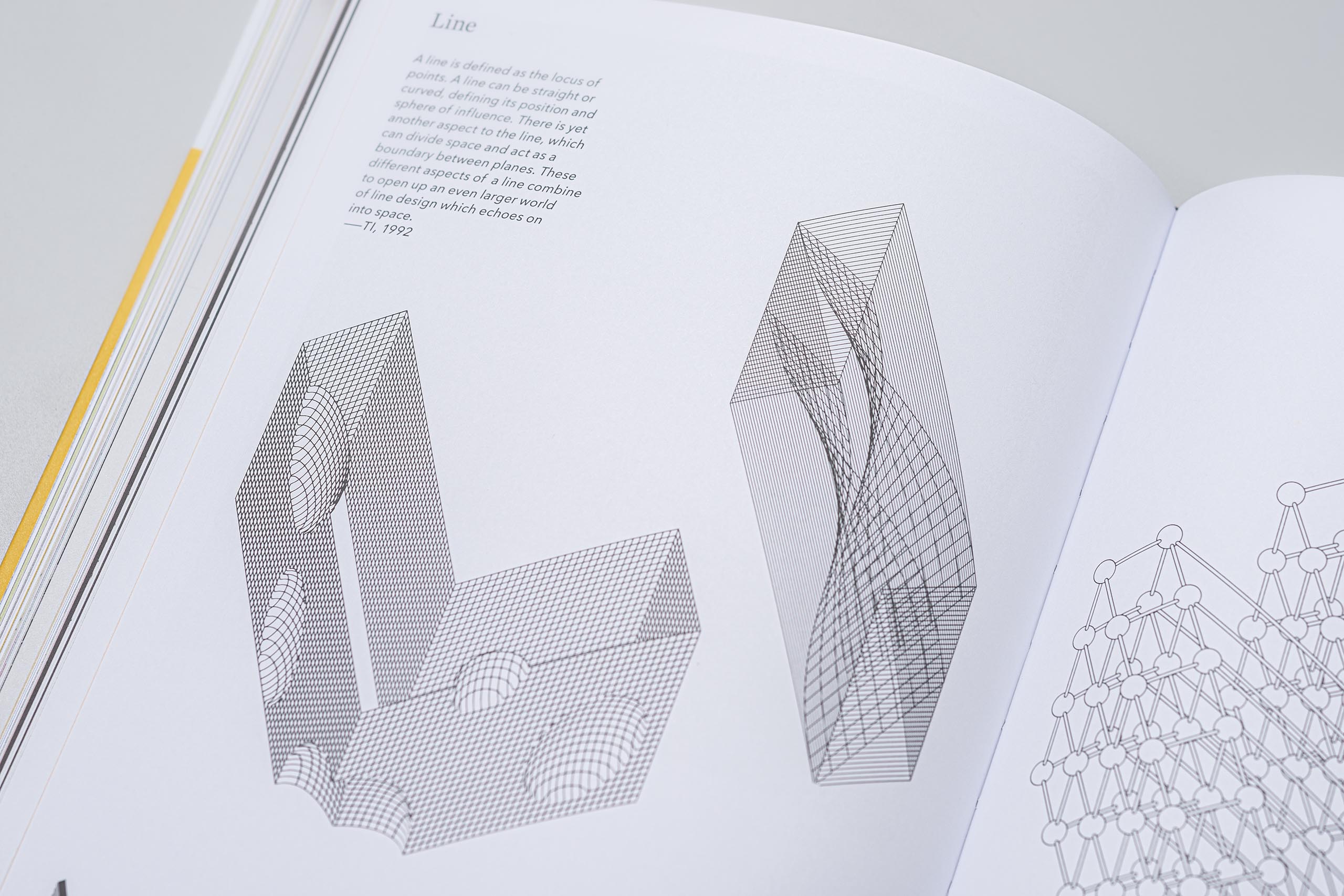
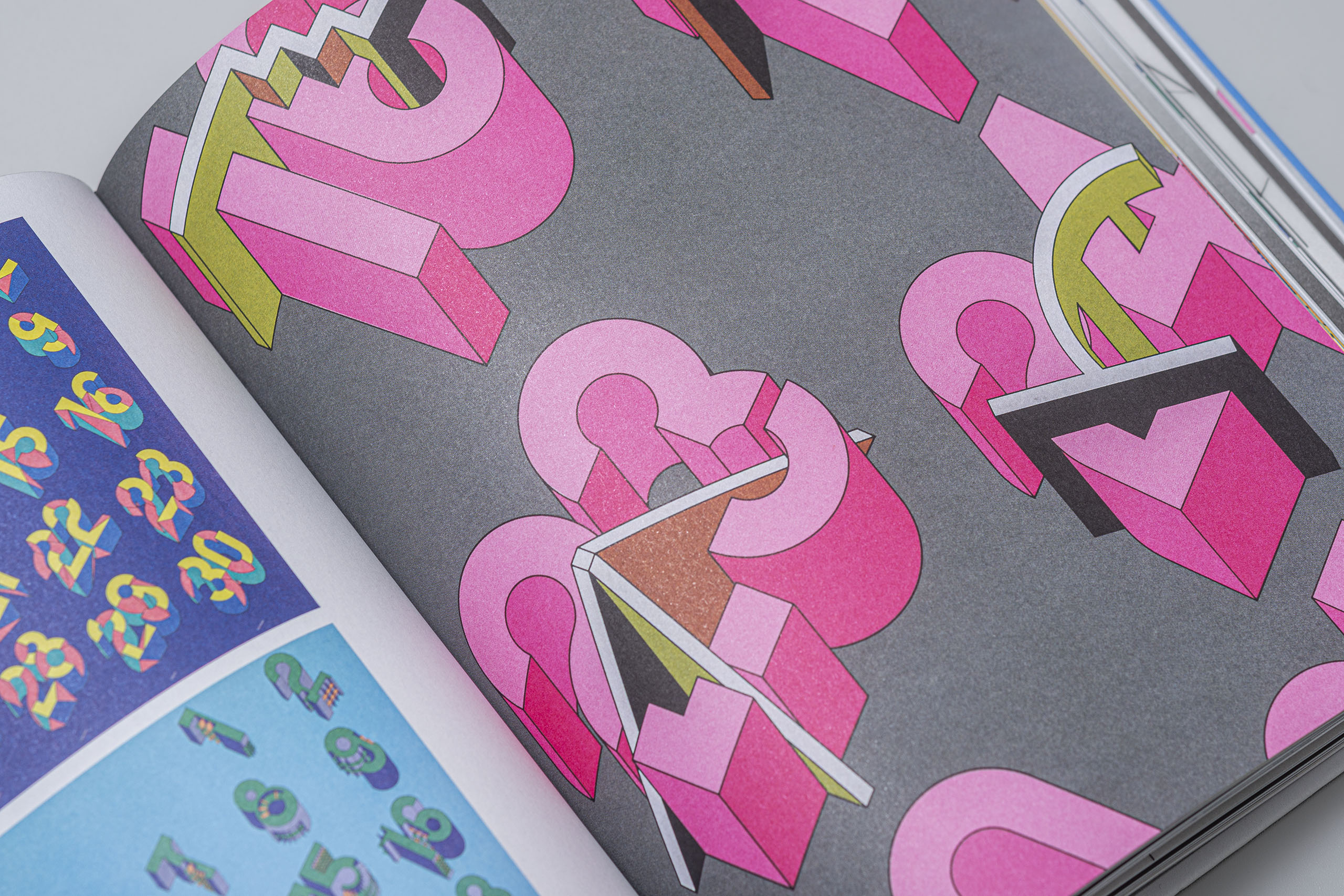
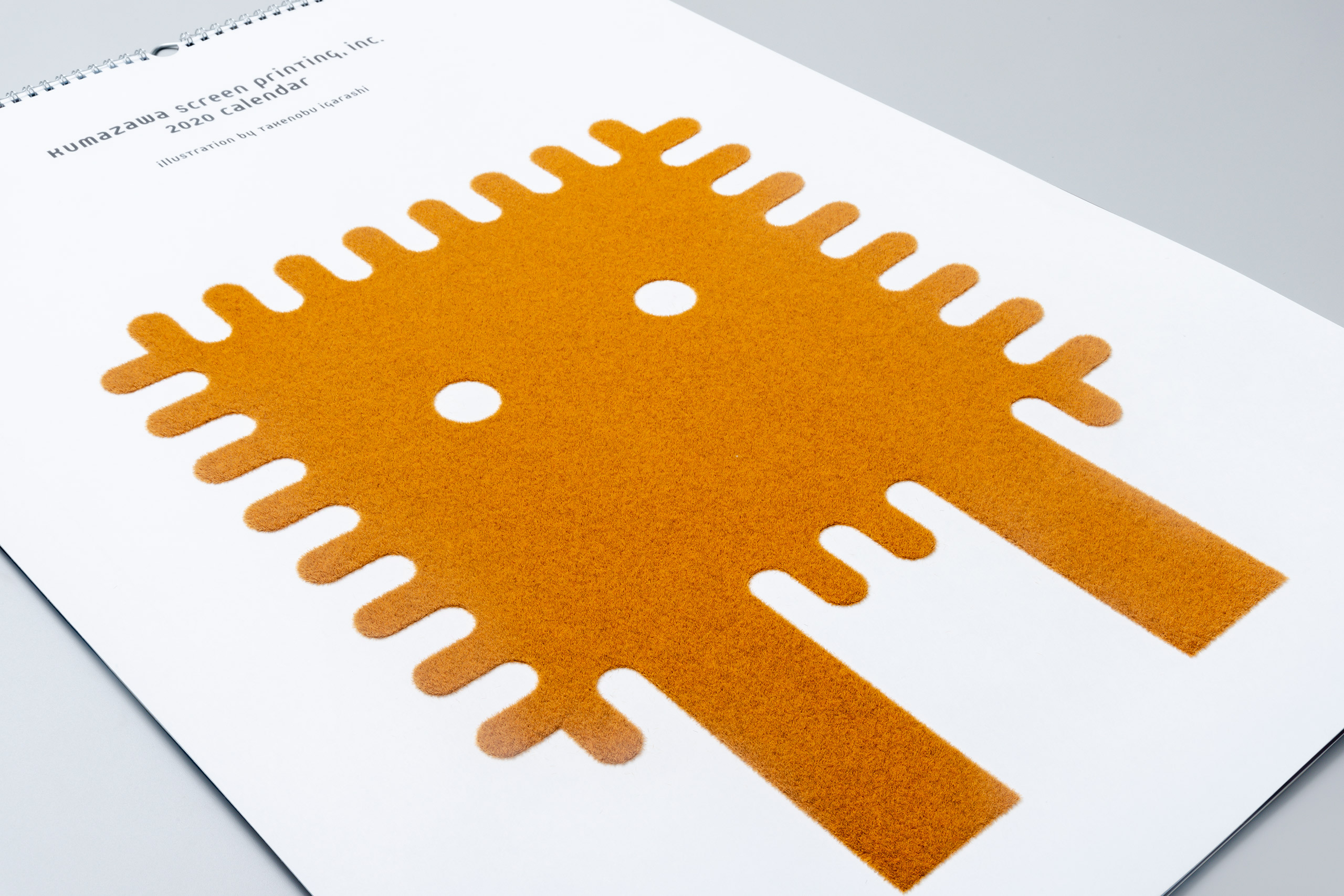
Since unveiling his alphabets in axonometric lettering in the mid-1970s, Igarashi continued to explore giving dimension to the Roman alphabets and numerals in countless variations. The extensive collection arranged in A-Z unravels the unique world of Igarashi’s alphabet works, which elevated typography from design to art, along with essays by Nomiyama which unravels Igarashi's unique approach to design and his thoughts behind his creations. Takenobu Igarashi A-Z was finally published in September 2020. We are proud to present this 384-page book, which is sure to entertain both design professionals, visually and as a source of insight, and the general public.
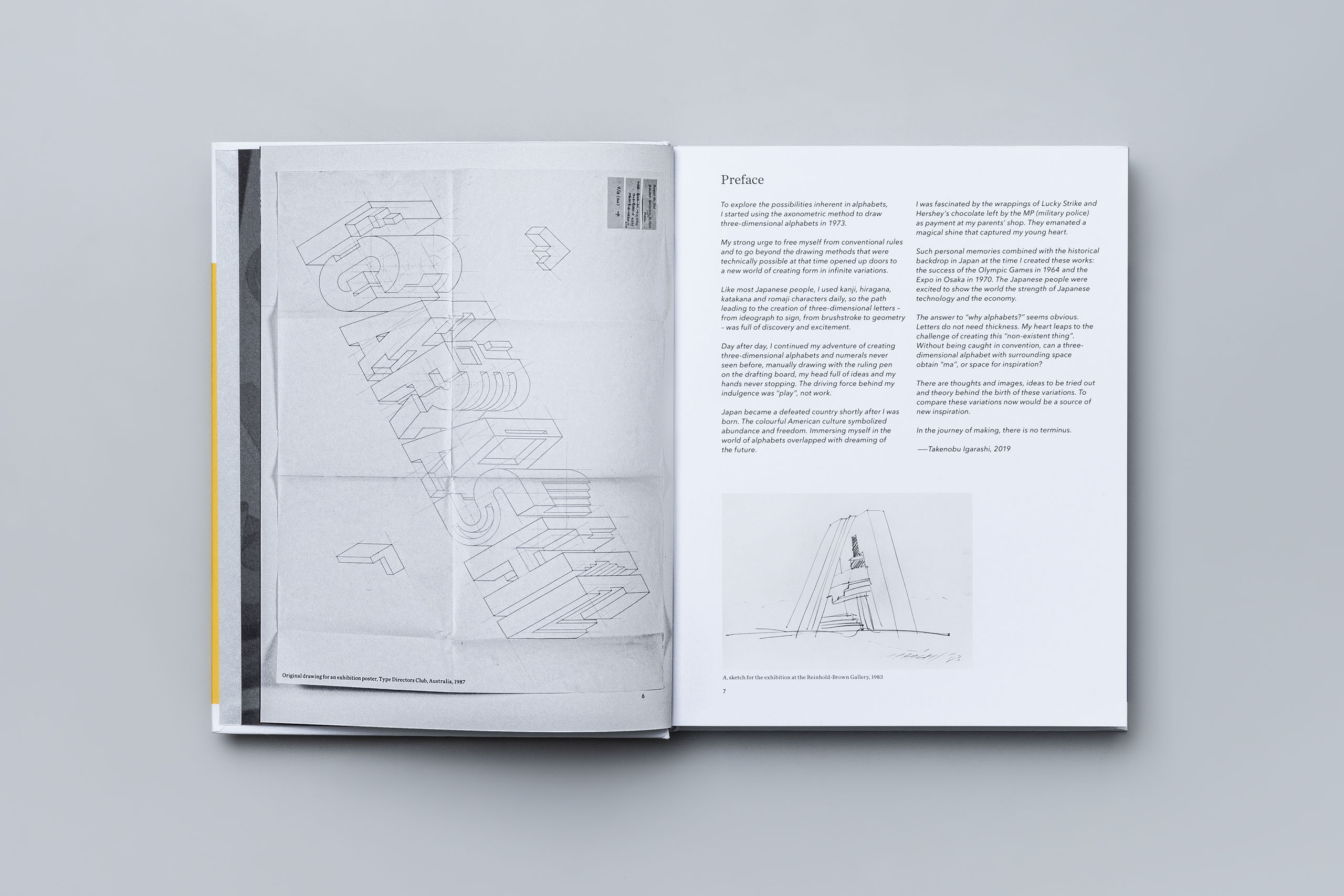

“When the London-based publisher Thames & Hudson (T&H) approached me about publishing a book of my works, I proposed focusing on the three-dimensional alphabets, which T&H accepted. However, as I had previously published a book of my alphabet collection, I needed a different approach in how the works are presented.
I decided to entrust the editing, design, and layout of the book, including taking new photos of the works and related materials, to people I trust; Sakura Nomiyama with the text and editing and Haruki Mori with the structure and design of the book. They worked closely with the publisher in putting together this fabulous book. My heart is filled with satisfaction and gratitude.”
Takenobu Igarashi


“It took a great deal of thought at first to determine the editorial direction and writing to express the profound world of Takenobu Igarashi's 3D typography in the form of a book. However, after engaging in a series of discussions with Igarashi and Mori, the book started to take shape and developed into this structure, introducing his collection from A to Z in alphabetical order. This style was possible thanks to the vast number of works available and was the best way to showcase their diversity. Keyword quotes and essays are also introduced throughout the book in alphabetical order.”
Sakura Nomiyama, Editor/Writer